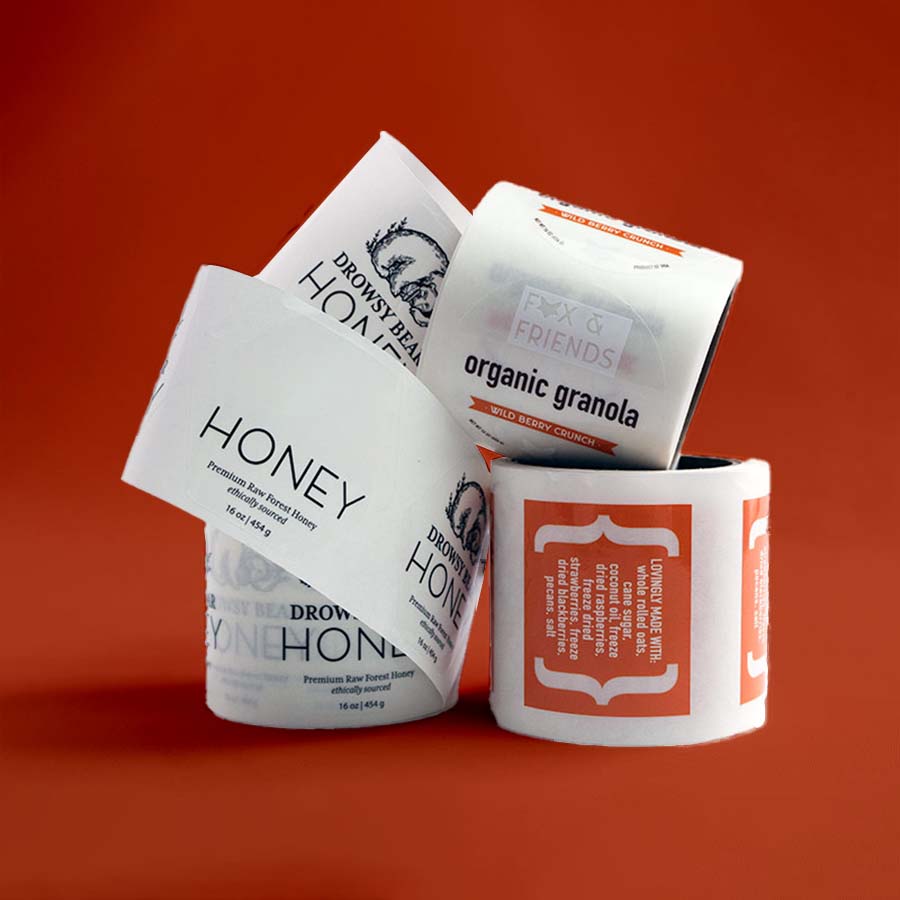
Pick up two identical jars of honey from a store shelf — same size, same weight, same price — and there’s a good chance one gets picked over the other simply because of what’s printed on the outside. Nobody tastes the honey before buying it. What they judge instead is the label: how clean the design looks, whether the information feels trustworthy, and whether the whole thing looks like it came from a brand that knows what it’s doing. That judgment happens in seconds, which is exactly why custom labels deserve far more attention than most businesses give them.
At Packaging Bee AU, label projects come through constantly, and a pattern shows up again and again: businesses spend months perfecting a product, then treat the label as a last-minute task squeezed in before launch. It’s an easy mistake to make, but it’s also one of the most fixable, because unlike a lot of branding decisions, getting labels right doesn’t require a huge budget — it requires the right process.
What a Label Is Actually Doing
A label carries more weight than people tend to give it credit for. It’s identification, information, and marketing all compressed onto a small surface. On a food product, it might list ingredients and allergens. On a cosmetic, it might carry usage instructions and batch numbers. On a candle or a soap bar, it might be doing almost nothing functional at all — existing purely to communicate the brand’s personality before a customer even picks the item up.
This dual role — practical and persuasive — is what makes product labelling trickier than it first appears. A label overloaded with legal text and fine print can look cluttered and uninviting, while one designed purely for aesthetics might leave out details a buyer actually needs before purchasing. Getting the balance right usually means designing the informational hierarchy first, then layering the branding around it, rather than the other way round.
Material Choices and Why They Matter
Not every label material behaves the same way once it leaves the printer. Some hold up fine sitting on a dry shelf indoors; others need to survive fridges, bathrooms, or direct sunlight without curling, fading, or peeling. A few common options include:
- Paper labels – affordable and suited to indoor, dry-use products
- Vinyl labels – water-resistant and durable, common on skincare or drink bottles
- Clear labels – give a “no-label” look, popular for minimalist branding where the container itself is part of the design
- Foil or metallic labels – used for a premium finish on gifts, cosmetics, or limited releases
- Waterproof labels – necessary for anything exposed to moisture, condensation, or outdoor conditions
A waterproof label on a bathroom product, for example, isn’t optional — it’s the difference between a label that still looks sharp after a few weeks and one that’s already peeling at the corners. Matching material to the product’s actual environment is one of the simplest ways to avoid returns or complaints down the line.
Where Design Decisions Actually Move the Needle
A few design choices tend to have outsized influence on how a label performs, both functionally and visually:
- Contrast between text and background — poor contrast makes ingredient lists and instructions hard to read, especially for older customers
- Font sizing for mandatory information, which often has legal minimums depending on the product category
- Colour consistency with the rest of the brand’s packaging, so labels don’t feel disconnected from boxes or bags
- White space, which keeps a label from feeling cramped even when it needs to carry a lot of information
- Finish — matte tends to read as understated and premium, while gloss reads brighter and more energetic
Businesses often underestimate how much a premium label design can shift perceived value. Two products with identical contents can be priced differently by customers simply based on how considered the label looks — cleaner typography and a cohesive colour palette read as quality, even before anything is tested or used.
Compliance Is Part of the Design Process, Not an Afterthought
For anything sold in Australia, particularly food, cosmetics, or supplements, labels aren’t just a branding tool — they’re a compliance requirement. Ingredient disclosure, allergen warnings, net weight, and country-of-origin statements often have specific formatting and placement rules depending on the product category. Skipping this step, or bolting it on after the design is finalised, tends to create messy last-minute rework.
The smarter approach is folding compliant packaging labels into the design brief from day one. A designer who knows the mandatory text requirements upfront can build the layout around them, rather than trying to squeeze legal copy into a design that was never built to hold it.
Small Batch vs Bulk Printing
One advantage labels have over most other packaging elements is flexibility in order size. A new business testing a product line doesn’t need to commit to thousands of units. Small batch label runs let a brand test a design in the real world, gather feedback, and adjust before scaling up. Once a design proves itself, moving to bulk custom label printing usually brings the per-unit cost down significantly, which matters once a product moves from early testing into steady retail or online sales.
This staged approach — small batch first, bulk once validated — tends to save businesses from a costly mistake: printing a large run of labels only to discover a typo, a colour mismatch, or a design that doesn’t actually resonate with customers once it’s out in the world.
Sustainability Considerations
As with most packaging categories, recyclable and biodegradable label materials have shifted from a nice-to-have to something customers actively look for. Adhesive choice matters here too — some adhesives interfere with recycling processes even when the label material itself is recyclable, so it’s worth asking suppliers directly about how their eco-friendly labels perform once they reach recycling streams, not just what the paper stock is made from.
Bringing It Together
A label might be one of the smallest pieces of a product’s overall packaging, but it’s often doing the most talking. It informs, it reassures, and in a lot of cases, it’s the single biggest factor in whether a product gets picked up off a shelf or scrolled past online. Treating label design as a core part of product development, rather than a final checkbox before launch, tends to pay off in ways that are easy to underestimate until the difference is seen side by side on a shelf.
It also helps to revisit labels periodically, the same way packaging and branding get reviewed over time. A design that felt current a couple of years ago can start to look dated next to newer competitors, even if the product inside hasn’t changed at all. Small refreshes — a slightly updated colour palette, a cleaner typeface, or clearer ingredient layout — can make an existing product feel new again without the cost of a full rebrand. For businesses working with a packaging partner that understands both the design and compliance side of labelling, these updates tend to be far smoother than starting from scratch each time.
In the end, a well-made label does something deceptively simple: it earns a second look. Everything else — the purchase, the loyalty, the repeat order — tends to follow from there.
About the Author