In busy aisles and fast moving online carts, first impressions decide what gets picked and what gets passed. That is where Packaging Design earns its keep. In Qatar, a clear front, confident color, and honest promise help shoppers make quick choices in hypermarkets, pharmacies, and delivery apps alike.
Why Packaging Design drives choice in Qatar
People buy with their eyes first. A pack that reads in a second saves time for shoppers in Doha and Lusail who compare options at a glance. Good Packaging Design shows what the product is, who it is for, and why it is worth the price without asking for a long read. The right look signals quality and lowers risk, which matters when a customer is trying a brand for the first time.
Design that works from aisle to app
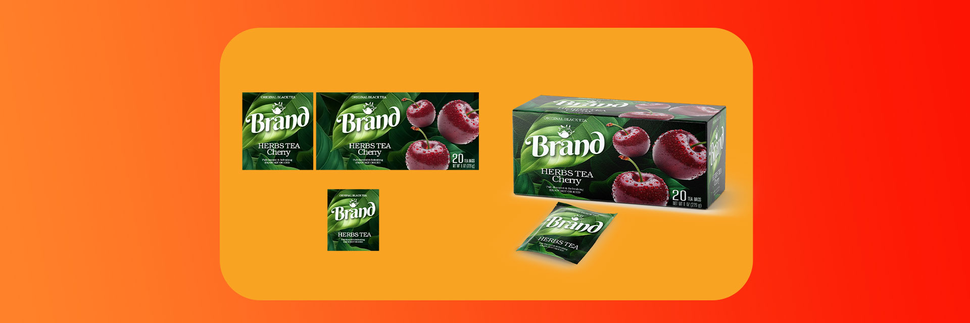
Great packs communicate at three ranges. From across the aisle, color and shape help the brand stand out in Msheireb and West Bay stores. At hand distance, a short benefit line and a couple of clear icons do the heavy lifting. Up close, tidy details like ingredients, usage, and size finish the job. The same logic applies online. On a small thumbnail, a big brand mark, simple contrast, and legible name win the click. Secondary images can show size in a hand, texture, and what is inside the box.
Packaging Design for a bilingual audience
Qatar moves smoothly between Arabic and English. Layouts should give both languages equal respect with a clear reading order and enough space to breathe. Choose Arabic and Latin typefaces that stay readable on sachets, travel sizes, and mobile screens. Avoid cramming. When the hierarchy is clear, customers feel considered and informed.
Built for heat, transit, and real life
The climate is part of the brief. Heat and humidity can loosen adhesives, fade inks, and stress seals during storage and last mile delivery. Pick stocks and finishes that hold up in the Gulf. Resealable closures for snacks, firm caps for personal care, and easy tear notches for quick use show you understand daily habits from Al Wakrah to The Pearl. Durable choices cut returns and support calls, which protects margin.
Local cues that feel authentic
Small cultural touches create belonging. Subtle patterns inspired by Islamic geometry, a palette that nods to Ramadan evenings or National Day, and respectful photography can place your brand in Qatar without clichés. Keep it modern and light. One or two smart cues are enough to spark recognition and pride.
Make honesty your advantage
Nothing earns trust like clarity. Keep claims plain and specific. Place expiry, storage, and safety notes where people expect them. Keep barcodes clean for quick scans at checkout. Show batch codes clearly for quality control. A calm, well organized back panel tells shoppers the product inside was made with the same care.
Sustainability shoppers can see
Customers notice simple, practical choices. Right sized boxes reduce waste and shipping cost. Recyclable or mono material packs make disposal easier at home. Use minimal inks and include clear disposal icons in both languages. Sustainable Packaging Design is not a trend piece. It is a series of small moves that add up to loyalty.
How to tell if the design is working
Watch behavior, not just opinions. Are more shoppers picking the product without a discount. Are reviews mentioning clarity and ease of use. Do retailers report fewer damages after delivery. Are online clicks increasing for the new pack versus the old one. These signals show when visual design is turning interest into action.
Conclusion
In Qatar’s fast market, design is not decoration. It is a sales tool that helps people find, trust, and choose your brand in a blink. Done well, Packaging Design makes a product easy to spot, easy to understand, and easy to keep buying. If you want your next launch to land stronger, start at the pack. It is the first and most persistent touchpoint your customer will see.